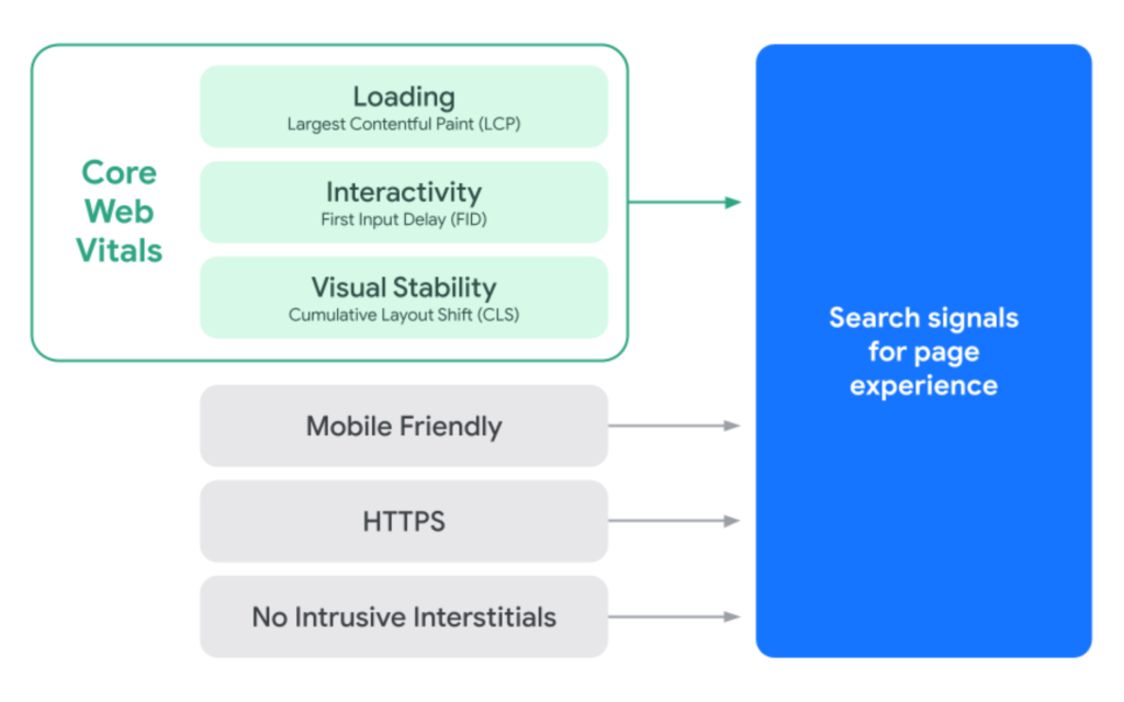
Google recently updated its Core Web Vitals documentation to shed light on the new “Interaction to Next Paint” (INP) metric. INP was introduced as a key user experience metric in 2024, replacing the older “First Input Delay” (FID) metric. This article explores the changes in scoring thresholds for INP, why it was introduced, and what it means for web performance and user experience.
What is Interaction to Next Paint (INP)?
Interaction to Next Paint (INP) measures how quickly a website responds to a user’s interactions, such as clicks, taps, or keyboard inputs. It’s unique because it calculates the latency for all interactions on a page, offering a more comprehensive picture of responsiveness compared to the retired First Input Delay (FID), which focused solely on the delay of the first interaction.
According to Google’s Web.dev documentation:
“INP observes the latency of all interactions a user has made with the page and reports a single value which all (or nearly all) interactions were beneath. A low INP means the page was consistently able to respond quickly to all—or the vast majority—of user interactions.”
This shift to INP means that web performance is now judged by how consistently a website can respond to every interaction, creating a much more accurate view of the overall user experience.
Core Web Vitals INP Scoring Thresholds
The latest update to the documentation reveals new thresholds for INP scores, each of which represents a different level of user experience:
- Good: A score of less than 200 milliseconds (ms)
- Needs Improvement: Scores between 200 ms and 500 ms
- Poor: A score of over 500 ms
These thresholds aim to ensure that the website interaction experience is quick and smooth for users on both mobile and desktop, even though mobile devices are often more limited in terms of processing power and network speed.
Why Set One Threshold for All Devices?

Instead of separate thresholds for mobile and desktop, Google decided to use a unified threshold for both. Here’s why:
- User Expectations: Users expect a similar experience on both mobile and desktop, regardless of the technical limitations of their devices.
- Simplicity: Having the same threshold across all devices makes it easier to understand and apply consistently.
- Device Overlap: Some devices, especially tablets, blur the line between mobile and desktop, making a unified threshold more practical.
The documentation explains:
“The Core Web Vitals recommended thresholds are not segregated by device and the same threshold is used for both. This also has the added benefit of making the thresholds simpler to understand.”
Consideration for Lower-End Devices
The Chrome team carefully considered lower-end mobile devices in setting these thresholds, as they represent a significant portion of global internet traffic. Achieving high INP scores on lower-end devices can be challenging, so the thresholds had to be realistic and achievable for these devices without sacrificing performance expectations.
Google’s research concluded that 200 ms is an appropriate threshold for a “good” score, as it reflects both user expectations and the real-world capabilities of many lower-end devices.
Influence of Popular Websites on INP Scoring
In deciding on a realistic threshold for “poor” scores, Google examined the performance of the top 10,000 most visited websites. Chrome’s team discovered that a 300 ms threshold for “poor” would categorize the majority of popular sites as underperforming. Instead, a threshold of 500 ms was set to accommodate the performance limitations of mobile sites while maintaining a level of achievability.
The documentation provides insight:
“On mobile, a 300 ms ‘poor’ threshold would classify the majority of popular sites as ‘poor’… while 500 ms fits better in the range of 10-30% of sites… 200 ms is a reasonable ‘good’ threshold for most sites, and greater than 500 ms is a reasonable ‘poor’ threshold.”
Insights from Web Performance Experts
Barry Pollard, a Web Performance Developer Advocate on Google Chrome and co-author of the INP documentation, shared additional context, commenting:
“We’ve made amazing strides on INP in the last year… But less than 200 ms is going to be very tough on low-end mobile devices for some time. While high-end mobile devices are absolute power horses now, the low-end is not increasing at anywhere near that rate…”
Pollard’s insight underscores the importance of balancing ambition in INP scoring with the realities of hardware limitations in various devices.
Key Takeaways on the New INP Core Web Vitals Score
The updated documentation offers a more detailed understanding of INP and the rationale behind its scoring system. Google’s focus on achievable metrics ensures that even websites accessed via lower-end mobile devices can strive for high scores. By analyzing real-world performance data and setting unified thresholds, Google aims to simplify the scoring system while still prioritizing a responsive, user-friendly experience across all devices.
The expansion of INP in Core Web Vitals marks a shift towards a more user-focused performance metric, emphasizing interaction quality for a consistent browsing experience. As more web developers and marketers adopt this new scoring, we can expect an evolution in how websites are optimized, ensuring greater speed, reliability, and user satisfaction.
Conclusion: What Does INP Mean for Website Owners?
The new INP metric challenges website owners to create faster and more responsive websites, which can enhance user satisfaction and engagement. By understanding and meeting the INP scoring thresholds, website developers can improve the user experience and positively impact search rankings.
INP and the Future of Core Web Vitals
With this update, Google has set the stage for further evolution in how web performance is measured. As websites grow more interactive, INP and similar metrics will continue to play a crucial role in ensuring that they offer an optimal experience, especially for the growing mobile audience.


